TalkMeUp
AI-powered Career Communication Coaching Platform
Scope
SaaS Startup
B2B
Team
Individual
Role
UX Design Intern
Date
Summer 2024
Overview
TalkMeUp is a B2B communication coaching platform that helps professionals improve their communication skills through real-time AI-powered feedback on tone, clarity, pace, and more.
As a UX/Product Design Intern, I was working cross-functionally with the product and AI engineering teams to improve key user flows and introduce new coaching features including AI Report.
01
Learning Page
Conducted user interviews and journey mapping to improve course prioritization and content hierarchy.
02
AI Report Page
Synthesized user feedback into a usability report that identified pain points in interpreting AI-generated communication scores.
01
Learning Page
Problem Space
Many first-time users reported confusion navigating the Learning Page. Through interviews and usability mapping, I identified key usability issues that made it difficult to prioritize courses and understand feedback content.
User Research
The Learning Page helps users access assigned and suggested training content, but users struggled to find relevant courses quickly.
I mapped the user journey map to identify friction points in navigation and hierarchy based on ToB clients' feedback:
Login to TMU website
Direct to learning page
Check if there’s any assigned courses (Top priority)
Check if there’s any unfinished courses (second priority)
Scroll through other courses (Least priority)
Click into the course

Pain Point
01
Fail to cover all info in one page
02
Readability issue on course description
03
Lack of direct button to key Analytics for each course
04
Clearer hierarchy of course icon
Iteration
Imporved Landing Page
After analyzing the user journey map and identifying issues like unclear course priority and hard-to-read descriptions, I…
Proposed layout changes that prioritized assigned courses and simplified content structure
Highlighted lessons and analytics button directly on the Learning Page to improve user flow and avoid unnecessary clicks
Redesigned the progress display into a single horizontal comparison bar across lessons, making it easier for users to visually compare their progress at a glance

Learning page (Iterations)


02
AI Report Page
Problem Space
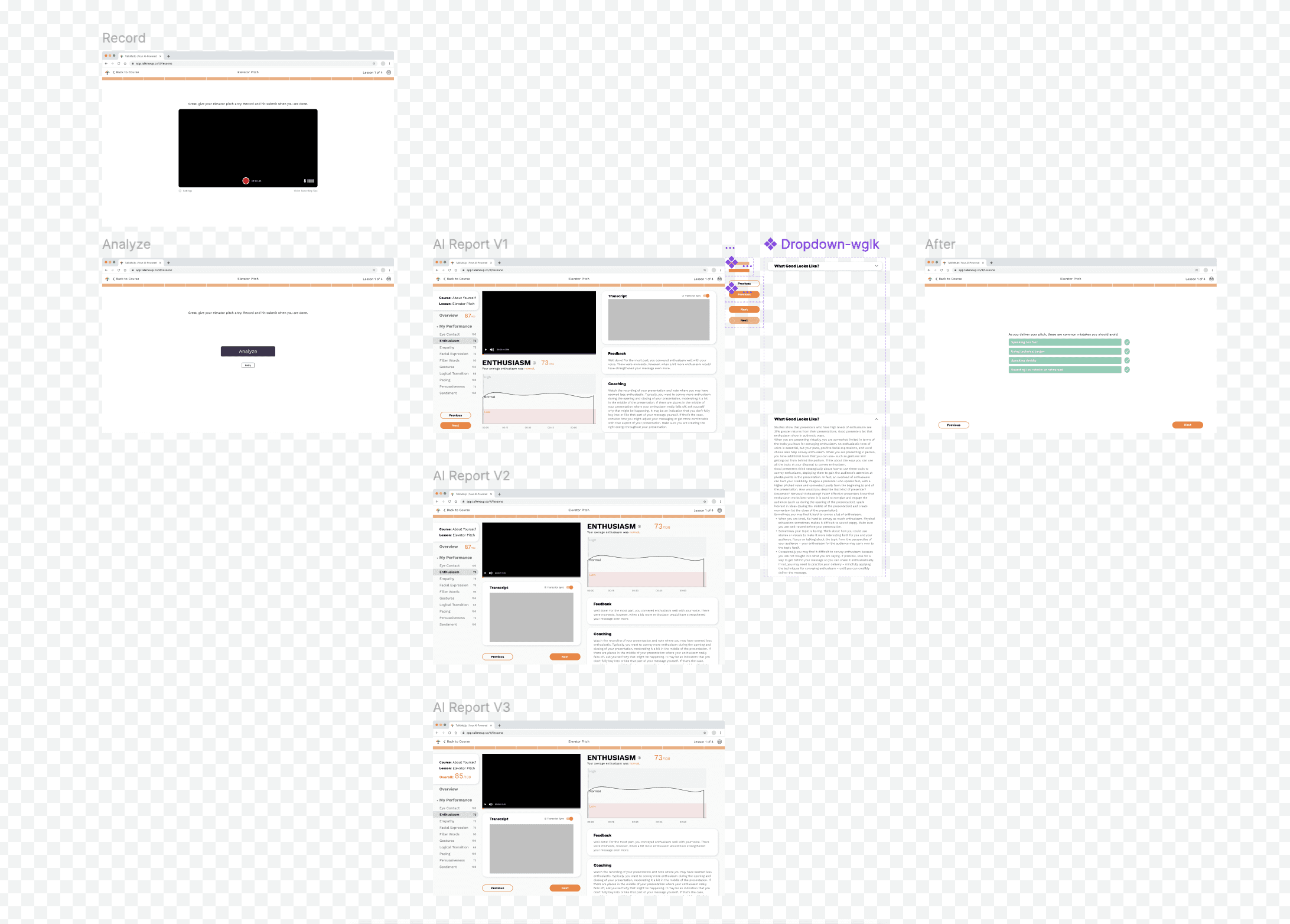
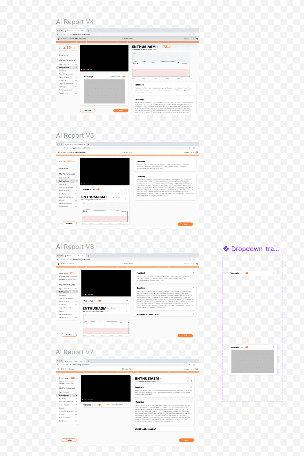
Through user feedback passed on by the UX lead and gathered from business customers, the AI Report Page presented performance scores without clear structure or visual hierarchy. Key metrics were laid out plainly without sections, making it hard to scan or focus. Re-recording after reviewing scores required extra steps, adding unnecessary friction to the practice loop.
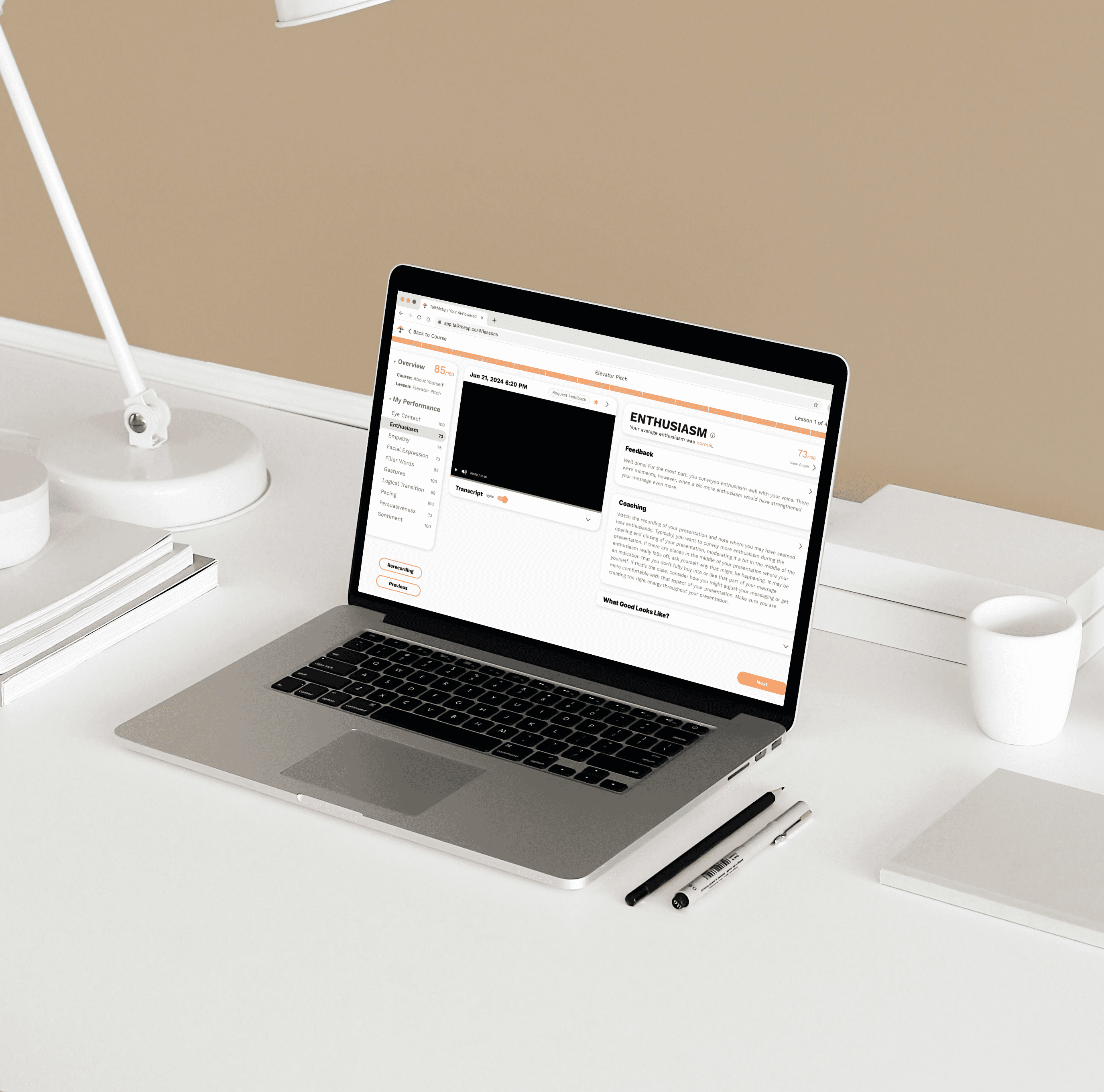
AI Report Page (Before)

User Research
I reviewed and analyzed feedback collected from business users to understand how they reviewed and interacted with the AI-generated communication scores.
Focused on navigation, visual structure, and system coherence, I noted recurring frustrations around the inability to retry directly from the report, difficulty returning to the main dashboard, and a sense that the AI Report Page felt like a separate product rather than part of the same experience.
The feedback highlighted both interaction and visual design gaps that needed to be addressed.
Pain Point
01
No retry button, which forced users to repeat steps just to re-record
02
No clear navigation back to the home/dashboard view
03
Color palette felt inconsistent with the overall product theme
04
Flat layout made all content feel dense and unstructured
Iteration
Polished to its best
During both weekly team and corp meetings, I shared my ongoing iterations of the AI Report Page along with feedback from business clients. I explored seven different versions, each focusing on improving layout, structure, and usability.
Throughout the process, I presented my work to the AI, engineering, and marketing teams to get input, make sure the design aligned with their needs, and keep everyone on the same page.
AI Report Page (Iterations)
Final Design
Smart AI Report
Guided by insights from business client feedback and cross team evaluations, I…
Added a prominent retry button to streamline the practice loop and reduce user effort
Introduced dropdown sections (e.g., “Coaching Feedback,” “What Good Looks Like”) to organize content and reduce cognitive load
Recommended updating the color scheme to align with the product’s main visual system, making the page feel more cohesive and less isolated
Improved navigation by suggesting a clear return path to the home dashboard for better system flow
AI Report Page (After)